Top Dog
Cross culture street food.
Identity Design
Naming
Copy
Art Direction
Packaging Design
Top Dog is a small fast food cloud-kitchen for hot dogs in India (currently available in Gurgaon & Ahmedabad).

the question
How do you introduce a new food category that can rival burgers and pizzas as a fast food staple to the home-eating audience?
Tl;Dr
Bold. In-your-face. Almost Cheeky. Meaty & Messy;
A logo that scatters. A colour thats saucy. A type system thats stuffed. A packaging that rolls the tongue.
the name
The message wasn't too deep. The best hot dogs; Good, meaty, saucy and drowning in flavour.
Not just sausage and bread,


the logo
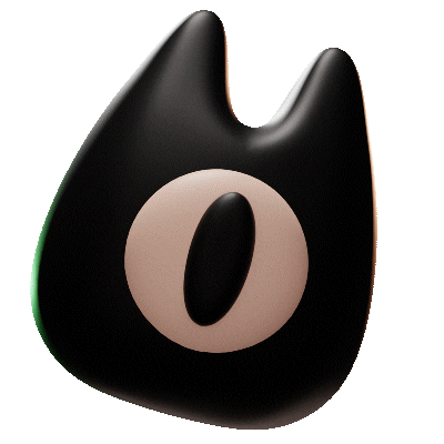
A custom letterform inspired by the meaty over-stuffed nature of hot dogs. Designed to be re-arranged and used as the dominant visual hook.
Same table - different mess.


flavour is in the mess
We use a loud typeface that takes centre stage and a hungry colour.
These elements are enough to make a meaty design but where's the mess?
In the sauce.
We use a script font and create a loose icon style inspired by the messy-saucy nature of hot dogs.
letting the dogs out
For Top Dog, the packaging is not a place to sell. Its an unboxing experience.
The pieces — A clean top. Visually dense pattern. Cheeky copy.
A clean top makes sure that the meaty-messy food reveal feels delightful. A dense pattern on the sides forces you to notice. Cheeky copy that gets you ready for a stuffing.


